Magazine practical task: blog work
Research
1) Use your lesson notes on magazine genres and conventions to view a range of potential magazine covers. Create a shortlist of three potential magazines and embed an example front cover from each one.


- Masthead at top (title,name of magazine)
- Strap line/ cover lines
- Price
- Date
- Direct mode of address
- Enigma codes
- Typography
- Colour scheme
- Main flash
- Links to social media
2) Select your chosen magazine to create a new edition for and explain the thinking behind your choice.
I have chosen to create a new edition for the 'Black Beauty' magazine as I like the magazine's intentions of bringing light and recognition to women of colour, celebrating and uplifting them.3) Find three different front covers for your chosen magazine and embed them in your blogpost. Analyse the fonts, colours and typical design. What is the language or writing style? How are the cover lines presented? You need to become an expert in the design and construction of this magazine and its branding.
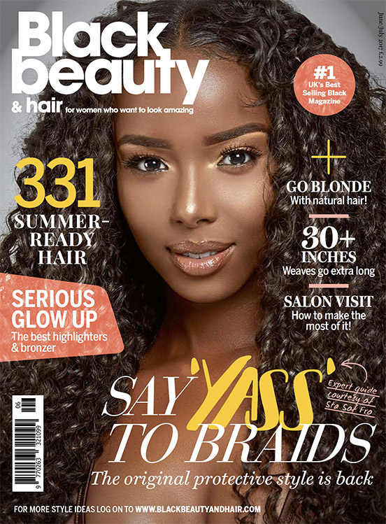 This uses the typical/traditional layout for a magazine with the masthead at the top. The central image uses a black woman which could be seen as alternative for a magazine (and advertising in general) because typically magazines use fairer models to promote their brand. The use of a woman of colour is a representation of the magazines values and target audience. The magazine uses a close colour scheme of white, yellow and orange which makes the text and masthead stand out and look bold. The colours used on this front cover compliment the woman's dark complexion which makes the cover look even more appealing to the customer.
  All Black beauty magazines use the same layout strapline - they use a statistic or number to draw the consumer's attention and want to continue reading on. This magazine uses a similar colour scheme of white and yellow to the previous magazine which shows that this company is quite consecutive with their magazine style. The magazine uses short and snappy taglines to catch the reader's eye and draw attention. One tagline used is 'must visit afro shops' which has been included to grab the attention of their main target audience - this fits with the idea that this magazine is focused around the beauty of darker skinned people and aimed at them. The central image uses mise en scene to further attract a consumer - the models bold makeup and pearl jewellery makes a statement of power and confidence which attracts women who desire to be this way too.
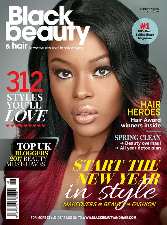
A noticeable trend in the Black beauty magazines is that every model they use in their central image is looking directly into the camera which makes it seem as if the model is looking directly at the consumer - this is intended to draw the reader more into the magazine cover to eventually continue reading. Again, we see the familiar colours of white and yellow however this time with a bit of red - this red has been added into the colour scheme as it matches the girls hair colour creating consistency throughout the cover, it also stands out and brings the front of this cover together. The boxed tagline to the left of the magazine mentions reference to UK beauty bloggers and their 'beauty must haves' - this would engage consumers as people tend to listen to people from social media who are well recognised and who have accelerated in their field and are influenced by their opinions and are interested in what they have to say.
Comments
Post a Comment